Facts against drama: fertility and child mortality rates
A data analysis portfolio, using pandas and statsmodels
Gapminder is an independent Swedish foundation with no political, religious or economic affiliations. This fact tank produces free resources, based on reliable statistics, promoting an easy-to-understand, fact-based worldview that is not overdramatic – as the usual narrative tends to be.
Statistics is the science of learning from data and of reducing complex structures and trends to succinct numerical descriptions and powerful visualisations. As such, it is an essential tool for understanding our complex world as it is.
The dataset
For the following analysis, we use data curated by the above-mentioned organisation. For all the countries in the world and for years starting in 1800, the dataset shows us basic facts about life in those countries: the population, the expected lifetime, the percentage of children surviving to the age of five, the average number of babies per woman, the gross domestic product (GDP) per capita – given in 2011 equivalent dollars – and the income available – on average – to each citizen each day.
Survival and births
Following Gapminder, a point that we want to make is that the number of babies per woman (known as “fertility”) depends strongly on child mortality: women have more children, when it is harder for them to survive. To see this, we plot the number of babies per woman and the percentage of children surviving to the age of five, selecting the data for the year, say, 1965.

Scatter plot for the year 1965; the colour map is described in the text and the dimension of the circles depends on the population of the specific country
The dimension of the dots depends on the population of each country. Also, different colours designate different regions of the world: Africa is blue, Europe is gold, America is green and Asia is coral. This plot shows very simply that, when children have hard times surviving, women give birth to more babies.
But the situation is getting better
We can go further, looking at the evolution of data from 1950 to 2015.
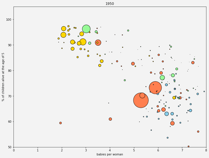
Scatter plot for a range of 65 years
This plot now shows the world initially divided between a developed world – low child mortality and low natality – and a developing one – high child mortality and high natality. However, this distinction largely disappears as we approach our days: in 2015, most of the world has caught up with the developed countries, so to speak. This is a tremendous achievement for humanity, and it is nice to see it from just a few numbers.
Conclusion and remarks
We live in a globalised world, where more people than ever care about global development. The world has never been less bad, even though it is far from perfect. However, a declining child mortality is only a partial answer to the question of why the global fertility rate has fallen so rapidly. As Max Roser from Our World in Data discusses in depth in his article, there are other two major reasons to consider: the empowerment of women (increasing access to education and increasing labour market participation) and a rising cost of bringing up children (to which the decline of child labour contributed).
In this notebook, we continue the analysis started here, creating and evaluating statistical models that allow us to describe these data. In particular, we focus on the predictive power of models and on how to evaluate such a fundamental aspect.